A New Magazine for the Podcast Industry
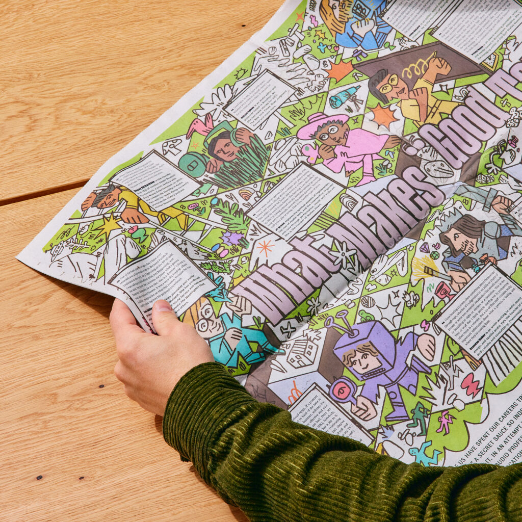
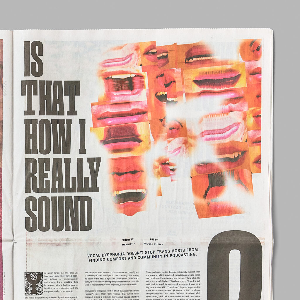
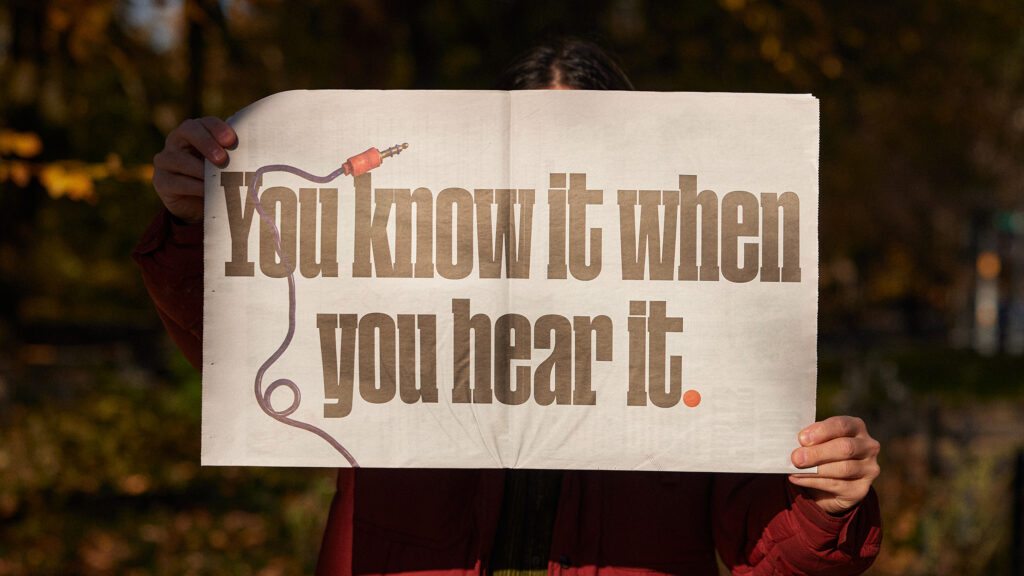
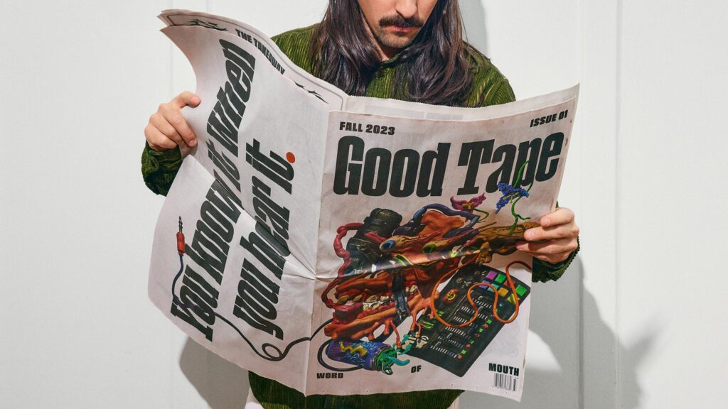
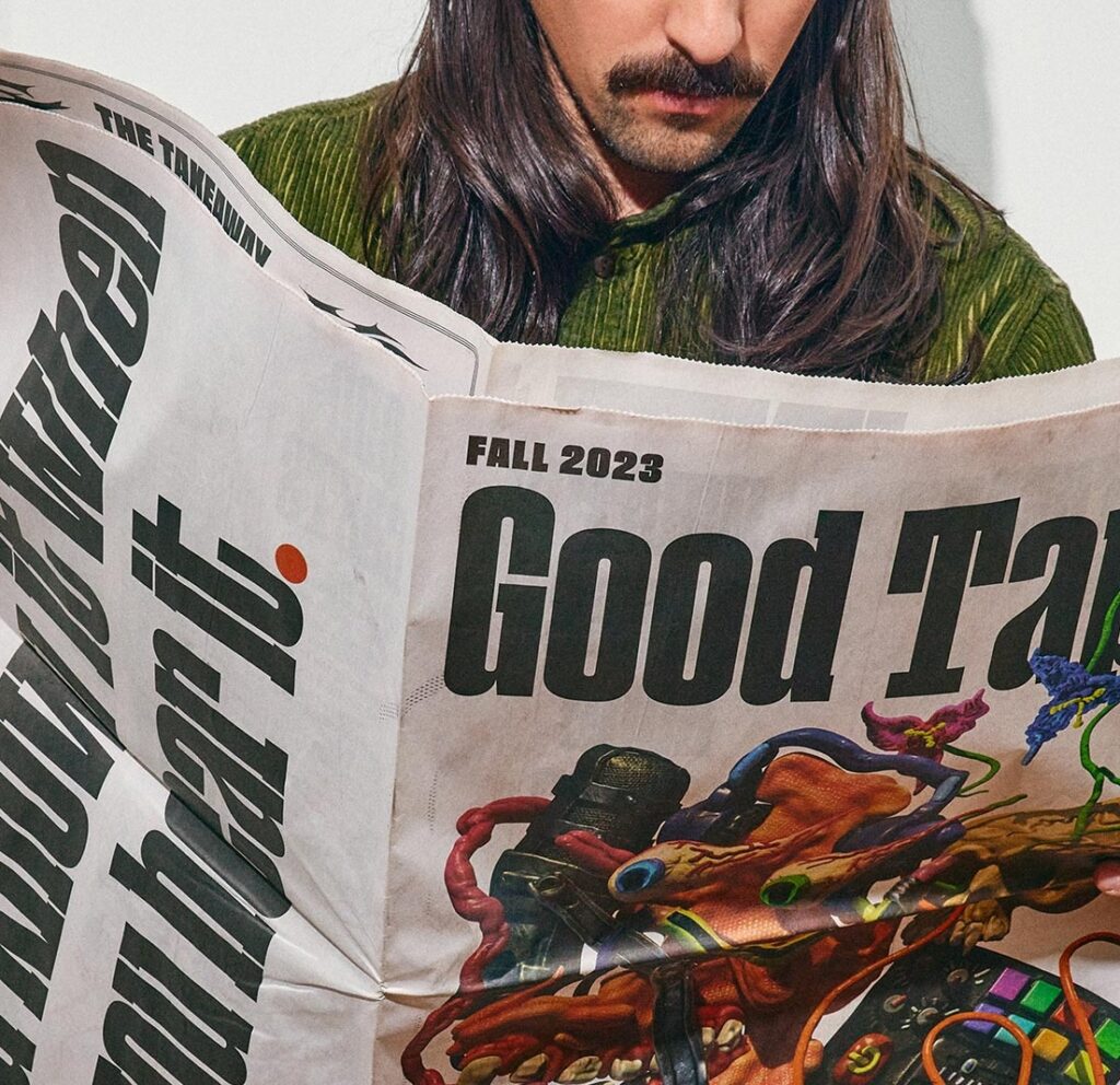
Good Tape Magazine finds its visual foundation in the alternative press of the 1970s whose formal constraints provided a structure for a variety of bold editorial art and illustrated features. Our type selection was made with the intent of nodding to these editorial aesthetic references without erring into nostalgia. We selected faces from a variety of foundries, all sharing sort of handworked interpretation of faces native to newsprint and alternative media.
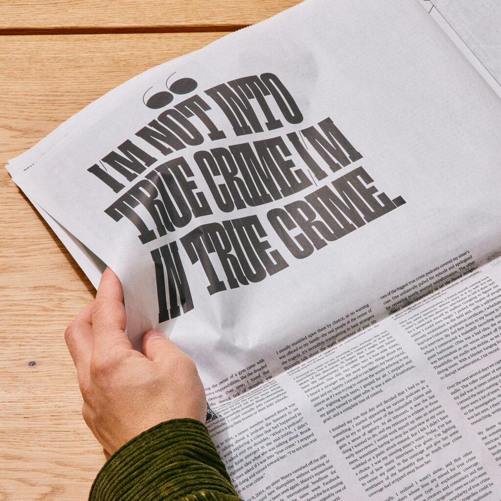
Prominently featured in the logo and article headlines, the display face Paraiso Heavy is an anchor for the visual language of the paper. Paraiso Sans, also by Lucas Descroix of Plain Form, is used throughout for accent and embellishment. Harking back to the bold display faces of 1970s alternative press and the Victorian wood typefaces that inspired them, Paraiso’s solid yet playful look had an appealing nod back to work that was inspirational to us as well.
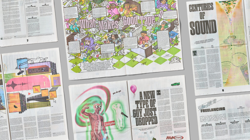
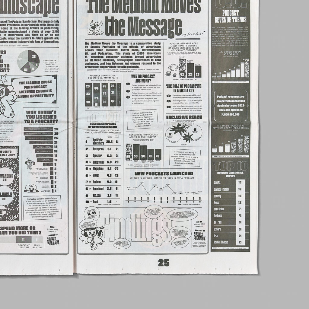
Tobias Rechsteiner hard-working GT Zirkon for Grilli Type was selected for a variety of uses throughout the issue. Working with newsprint comes with an inherent risk of bleed, so the exaggerated ink traps not only provided a stylistic benefit, but allowed for legibility at the smaller scales we were looking for.
For our body copy, we wanted a face that prioritized legibility and clarity. In Commercial Type’s Publico Text, we found a family of fonts with its origins in newspaper design.
All photos by Robert Bredvad.
