Does Your Video Podcast Look Like Trash?
A lot has been said about the format-shaking ramifications of video podcasting’s rise. But relatively little has been spent on the state and quality of set design in podcasting. It’s an odd oversight for such a prominent feature in a show’s look and feel.
At Good Tape Studio, we’ve recently begun offering fabrication and set design services to clients with video podcasts. As this new normal spreads to production studios and networks across the industry, I thought it would be good to get a few opinions from experts on the current visual landscape of video podcast design. And, more importantly, establish some shared language for what you should consider before your next set buildout.
First, let’s review some basics before jumping headfirst into your set project.
- Camera setup: I won’t get into specific camera equipment recommendations, but the three-camera setup appears to be most common, with one center-wide shot and two tight shots on each subject. Most video podcasts feature either one-on-one interviews or two hosts interviewing a single guest. Ask yourself if this will be the most consistent setup, or if you anticipate needing additional framings for ad reads, subscriber-only content, four or more subjects, etc. How many cameras you have rolling simultaneously, how much of your set they will capture at once, and what portions of the background will be in frame will influence your set’s construction and design.
- Backgrounds: The rise of video has been spurred by how quickly short clips spread on social media. From a design perspective, it’s important to consider whether you want your tight shots to have similar or distinctly different backdrops. Is the cohesiveness in the design important? Or would you prefer complementary yet variable backdrops to keep fans engaged?
- Lighting: This is one of the most important and underappreciated items on this list. Lighting can drastically transform any space, and the most thoughtful set design can be undermined by hastily hung lights and a too-bright general wash. Be prepared to hire a gaffer (lighting designer and technician) to create a tone, mood, and texture that complements your set. (This will become especially important for shows that use multi-use sets; see below.)
- Comfort: This part takes time and a willingness to “Goldilocks” your way to an environment that your guests will be comfortable in. Finding the right chair is your first order of business. How big is it? Is it soft or firm? Does it lean, swivel, or both? There are endless decisions, but stay focused on a balanced mix of comfort and style.
- Microphones: I predict this will become a hot topic in 2026. There has previously been a solidified internet aesthetic for the standard podcast microphone and boom arm. But some shows are attempting to break from the pack and return to our public-access roots with lav mics and/or overhead mics. What was previously an audio consideration is now an aesthetic question as well.
- Multiuse: If other shows use your set, you may be limited in how much of your personality you can imbue into the design. Having modular elements you can easily bring into the space and store just out of frame as needed can be a good way to personalize your base set. This is also where creating a unique lighting plot will come in handy, helping your show stand out from the others that film on the same set.
Let’s now evaluate some podcast sets against the criteria above. Thank you to our experts for lending their opinions. (Note: responses have been lightly edited for length and clarity.)
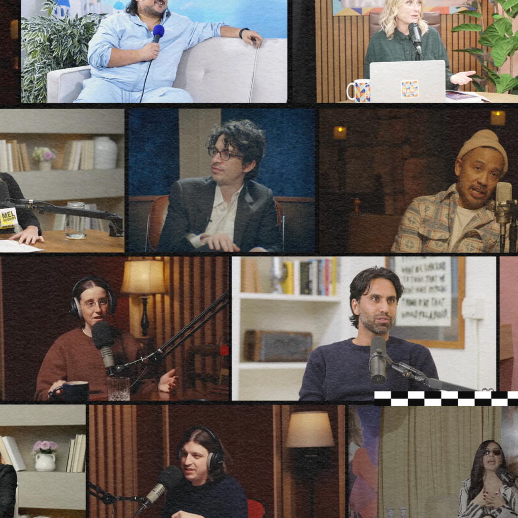
“Good Hang with Amy Poehler”
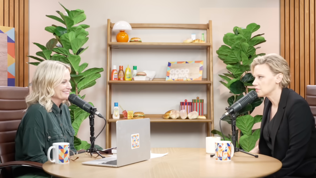
“It seems pretty straight up to me. It’s very high key. It’s kind of lit like the news; very flat lighting, which is great for the host. And it’s flexible because you put anyone in that lighting scenario, and they’ll look pretty good. But I don’t necessarily think it has much creativity. To me it looks like the news. The set design is a bit more fun, so maybe the visual personality of this set comes from the production design versus the cam work or the lighting.”
— Ray Huang, director of photography
“This set is pretty minimal and modern; it doesn’t do much for me. There’s obviously a theme of organic plant life, which is really big in office space, conversation space, dialogue, something alive — you know, usually fake — but here the symmetry is attractive. There’s a mirroring of the speakers within the set, so that does a lot, and of course when we’re moving from one side of the room to the first shot, you end up orienting yourself quite easily, even if your speakers look similar, because the objects are on the opposite side of the room. So, you know, it works but it does very little emotionally, and it’s probably meant to do very little emotionally. It’s trying to keep you focused on what’s being said. It’s a pleasant aesthetic, while not trying to trigger much of a reaction.”
— Z Behl, visual artist and filmmaker
“The first thing that I always think of when I see clips of ‘Good Hang’ is I hate the lighting. It’s so flat. I’m just not a fan of the flat lighting I’ve seen in a bunch of podcasts. I think social media has affected the way people think about lighting and what they think good lighting is, and they think good lighting is a lot of light on the face. And I just don’t think that is as flattering as working with shadows. It makes me think of a doctor’s office or a waiting room. As far as the setting goes, it’s pretty standard: the wood paneling, the fake plants, the shelves with tchotchkes on them. I think it’s time to change it up. And I know a lot of people are afraid of trying new things and want to go with things that they have seen work already. But then the issue is you’re not standing out, you’re blending in, and I think part of the game here is to stand out.”
— Casey Donahue, supervising video podcast producer
“The Adam Friedland Show”

“This one has a kind of late-night TV host vibe to me. There’s a little bit more drama in the lighting and the set design. It’s a bit moodier. But again, it’s very, very flat lighting here too.”
— Ray Huang, director of photography
“There are some interesting moments here. I do like the lighting structure. It’s a little dark. [Adam] gets quite literally blended into the background.”
— Mark A. Terry, art director
“I’ve always really liked Adam’s set. I like how he leans into the old-time talk show vibe. I think he must work with a designer because it feels really tasteful. It’s very flattering, and I think he does a great job. A great example of getting away from the standard podcast look. Having lighting that is both professional and flattering, even the hair light, it’s just really nice. It separates from the background, [which] is also lit on its own. They do great work with ‘The Adam Friedland Show.’”
— Casey Donahue, supervising video podcast producer
“This set is much moodier. It speaks to the vibe of his show, as compared to [‘Good Hang’]. He’s going for something that’s, I think, sort of formal and at the same time really experimental and off the cuff, and so he likes to have that subversion in the imagery as well. This kind of feels ’70s to me with the wall-to-wall carpeting, his really nice expensive leather chairs, [how] you’re seeing the full body rather than just torsos at a table. And then this almost ‘Twin Peaks’ kind of blue velvet backdrop lit with those individual incandescent lamps pointed down, and so you’re getting the drama of the texture of the wall there. I think we’re meant to look within, is the idea of this set.”
— Z Behl, visual artist and filmmaker
“Call Her Daddy”

“This one seems to have the most well-thought-out set. Like, [Adam Friedland’s set] seemed pretty high-quality in terms of the set construction, but not much personality; it was pretty generic. [The ‘Call Her Daddy’ set] seems to have more personality, you know, with the color palette, the set decoration on the shelves, these velvety oversized chairs and the marble table. It’s saying something about the vibe of this show and the color palette. Again, similarly flat, pretty high-key look, but this one seems to be a bit more modern in style, where there’s less backlight and more front light. The things that stand out as [not] that well-done are the mics. The mics feel a little, like, not integrated into the design of it in a way.”
— Ray Huang, director of photography
“So, here the set feels as though it’s meant to evoke somewhere in between a casual, almost like dorm-room girls hang, and then also something that could pass for ‘corporate lobby.’ Again, this is feeling a little ’70s-inspired. It feels almost like a man cave, but for women. The marble table is quite a handsome object, and it really does anchor everything in the room, which is an interesting, loud choice as a place setting for this conversation. The vase with the two sprigs in the upper left-hand frame is the one thing that offsets the symmetry here and it’s nice. It feels good to have that.”
— Z Behl, visual artist and filmmaker
“This looks like a corner of a mall. They’re doing perfectly fine, but there’s going to be a point where they will have to up their game and a designer will have to get involved.”
— Mark A. Terry, art director
“This isn’t bad. The only thing I don’t like is the profile look in the wide shot where they’re looking directly at each other from across the room. I just don’t think that’s a flattering image for an interview. I think even just cheating them out toward the camera a little bit [would help].”
— Casey Donahue, supervising video podcast producer
“Colin and Samir”

“This one looks the most amateur to me because of — I think — the lensing, and just the overall mise-en-scène of the whole set. It looks like they had a room that was kind of small and they used a really wide angle lens to make the room feel bigger in the wide shot. The lighting is just totally flat. The other ones were flat, but they at least had some sculpting to them. This just seems like someone bounced a bunch of lights into the ceiling and then called it a day.”
— Ray Huang, director of photography
“To me this just reads as they don’t care what the setting looks like. So there’s a lot you could do to fix that. Even the placement of the camera in the room. It doesn’t look like they thought about what angle they were going to be coming at, or even framing up.”
— Casey Donahue, supervising video podcast producer
“This is the ‘less is more’ direction, I guess. It is behind the scenes, but that’s not a visual space. So apart from getting to see the faces, the bodies, the gestures of the performers, we’re not really offered much in order to be sacrificing our time to be witnessing video instead of [listening to an audio] podcast. For instance, the white round table that is in the center of the frame is just completely dead space, and it’s the largest and brightest and most centered object, so our eyes gravitate toward that and then there’s no reason to look away. You just come into this dead space, and everything else becomes noise, including the bodies. It’s really not grounding in any way. Nothing feels intentional or considered, which if you picked an interesting space to shoot and then you let a randomizing aspect to how you frame it, I would get that. But this is just really boring. This is the visual equivalent of white noise in a way that I find obnoxious or grading.”
— Z Behl, visual artist and filmmaker
“Talk Easy with Sam Fragoso”

“This one has a much more intimate vibe to me, primarily because of the use of all the warm color palettes from the wall panel to the table to the lighting. It’s more like a living room [or] music studio. You can see that it’s not flat here. It’s front lit, but it’s saucier, you know. There’re shadows on the face. So to me, there’s a bit more of an intimacy here because of those elements.”
— Ray Huang, director of photography
“This is as if we went into an opera house or a corner Italian bar. Very low lighting. It’s definitely intimate with the guest. I would love to see those [large microphones] go away.”
— Mark A. Terry, art director
“Yeah, I love this. This really soft, warm lighting. I love warm lighting. I think it’s flattering to everybody. It is inviting to the guests entering the space. I think lighting is about trying to create the environment for the conversation you want to have, and ‘Talk Easy’ is really good at those kinds of conversations, and it shows with how inviting this set looks. I also really love practical lighting in the frame, like lamps. It always helps light the set a bit, and also, depending on where you put it in the space, it could give a little bit of fill to the people talking.”
— Casey Donahue, supervising video podcast producer
“It’s nice to see the light fixtures in the room. For some reason that creates a real sense of warmth and depth to the space. It becomes less of an abstract conceit and more of a world. But this still lacks a certain degree of the imagination and the abstraction that you could have, right? Because it is just kind of showing a room that’s evoking sound recording and we’re seeing the equipment and the headphones. It’s aesthetically pleasing, but why is this what we’re looking at? What else would you say? What else could you add? I find it visually warm and I can enjoy seeing it; on the other hand, it feels a little bit like a lost opportunity. Anything more could be done here. And I like the lighting, it’s the right direction to be moving in to create a sense of this being a specific space rather than a conceptual space.”
— Z Behl, visual artist and filmmaker
“The Bald and the Beautiful with Trixie and Katya”

“That’s a fun set design. The production design tells you a lot about the show. It feels like you’re in someone’s closet because it’s so tight in there. It feels like they’re sitting right up against the backdrop, which I don’t know if it’s good or bad. Like typically that’s something you wouldn’t want to do, but to me this looks like these Instagrammable art exhibits that pop up everywhere, where they look great in the Instagram frame, but when you see them in real life, they look like trash. You know what I mean? That’s exactly what this looks like, and maybe that’s the vibe of this show, you know?”
— Ray Huang, director of photography
“It reminds me of late MTV days when they were just throwing stuff at the wall to see if it [sticks], and that’s kind of what this feels like. It’s very chaotic.”
— Mark A. Terry, art director
“This is a fun set. I like how they cut it in half based on their personalities. It gives it a really fun look, especially with how the shots work with each other. Not only do the singles both look different from each other with their backdrop, but then it plays together in the wide. Really smart creative approach.”
— Casey Donahue, supervising video podcast producer
“There’s so much going on in here. I love the idea of the pink and the red here as opposing dualities. You have a very literal visual riff on that with the same shelving unit in a different color. I will say that the blacks and the darks get a little lost in the videography here, and maybe rather than just going white and black, there could have been a little bit more subtlety there in those choices, so that the pop was more successful. I like these knickknacks. I think they’re telling a story. The placement of them is a little haphazard. It’s verging on too much going on, but depending on how it’s shot, that could be interesting. It feels as though it would be really nice if the placement of what was there was slightly more considered in relation to where the bodies are within the space. So I like that there’s a lot happening and a lot to lock into, but I wish that it wasn’t competing with my attention on the podcasters themselves. They had a great concept and I think the execution here is just lacking a little bit in the final choices, which is too bad because there’s just a lot going for it, and then it kind of does too much and feels cheap.”
— Z Behl, visual artist and filmmaker
“Stavvy’s World”

“This one’s kind of fun. There’s a color palette that’s kind of unified with [Stavvy], and even the mic, it looks like a blue mic foam. And then even the font they use, you know, it’s very campy, right? I think a decent use of fake plants here as well. There is a facade happening and it’s fine.”
— Ray Huang, director of photography
“I think Stavvy’s set is really fun and fits him in a great way. The landscape painting, I can tell, is supposed to feel like a Greek restaurant. I get the same feeling when I go to some Italian places and it’s like a Tuscan landscape painted on the wall. That is clearly what Stavvy is going for and I think he does a really great job.”
— Casey Donahue, supervising video podcast producer
“Masters of Scale”

“This one’s a little bit weird to me. It’s just a purple void, but there’s something about it. It’s kind of a cool concept, using light as the production design in a way. There are plenty of examples of this where light is the central production design motif.”
— Ray Huang, director of photography
“My initial reaction is like they’re inside of a bubble and it’s popping. There’re a lot of elements here that I’m a little unsure about, like with the greens. I do think they’ve probably hired a college student to dress it, which, again, I don’t wanna fault anyone for budgetary stuff. I’ve been there.”
— Mark A. Terry, art director
“This just feels vile to me. And it has something to do with the fact that we have just, like, bare nature stripped of anything else, with this very unholy light that just doesn’t make any sense and is inhumane-feeling. And then this very white furniture that hasn’t been touched. Nothing’s been touched, nothing feels comfortable. [It’s] something that’s meant to be alive, but it’s clearly plastic; it’s just an artificial world.”
— Z Behl, visual artist and filmmaker
“The Bill Simmons Podcast”

“That is one busy shot. It fits in with the whole stats, memorabilia, ephemera kind of thing. It’s really busy though. The people totally get lost in the frame. But maybe the maximalist vibe fits. Again, it’s really flat lighting, but I think once you go to a more than two-person format, you don’t have many choices with the lighting for multi-camera. If you have two people, you have some choices. Once you move past two people, you have pretty much: top light, back light, front light, and that’s it.”
— Ray Huang, director of photography
“I look at this set and I know what they’re gonna be talking about. I know that you’re gonna get a little bit of sports and you’re gonna get heavy film. I see nothing wrong. It’s a two-wall set. I love a two-wall set.”
— Mark A. Terry, art director
“This is a good example of designing the set to fit the character or vibe of the host.”
— Casey Donahue, supervising video podcast producer
“Long Winded with Gabby Windey”

“This one’s hilarious. I love this one. It looks really trashy. It looks like [public-access] TV, which to me is interesting because it’s saying something about something, right? I mean, the lighting is crappy, like someone put a hard light right next to the camera, [but] it’s a vibe.”
— Ray Huang, director of photography
“Whatever the show is, is it doing justice to what you’re trying to sell? You should be able to look at what they’re trying to sell or get a glimpse of what they’re trying to achieve, and I’m a little unsure here. This reminds me of whatever was left over in the drama department or a corner of a Goodwill.”
— Mark A. Terry, art director
“Interesting. It feels like there’s intention behind it not looking very good. I think that’s part of the aesthetic here, because there are details here that make me go like, yeah, they’ve thought about this — the coloring of the carpet and the coloring of the furniture and the coloring of the curtains all kind of work well together, but the camera angles are crazy to me.”
— Casey Donahue, supervising video podcast producer
“This feels really refreshing after looking at so much of this other stuff. We’ve entered a space that’s cinematic. It feels like there were real choices made here about why there’s a T-shirt hanging on a curtained wall. I mean, that’s an unusual thing, and it works, and somebody’s ironed it. And the objects in the room are all very cohesive, and the palette is very consistent, and the amount of stuff feels right for capturing your attention, not boring you. And then also just interesting compositions. I would imagine that whoever made this set also made a really great PDF pitch deck for the mood board for what they were going for.”
— Z Behl, visual artist and filmmaker
“Official Game of Thrones Podcast”

“I see more of a production budget here with lighting in general [and] everything in the background. It’s getting there, it’s just not there.”
— Mark A. Terry, art director
“This is clearly professionally lit, warm lighting, flattering soft shadows. They’ve separated from the background a great deal. A lot of podcasts are recorded in such small spaces that it’s hard to create a separation from the subject in the background. But if you can create separation [between] the subject and the background, it will make your show look so much higher production value just from that alone. And then if you just point a light at the background, and it’s different from the light on the subject’s face. Those little things will make it look like you put tens of thousands of dollars into the design and look of your show.”
— Casey Donahue, supervising video podcast producer
“If you have that kind of money, why are you doing this? The candles are exciting. Medieval table, sure. But then, like, why not have some swords? I like that the chairs have fur on them. It feels like we’re straddling something. They want to go, like, ‘Here we are on the set of the show,’ but they also want to show that this is the podcast studio. So it feels very 50/50 to me, like a little half-hearted. It’s fine, but if you have that kind of budget, I don’t know, why not have a bizarre chandelier or something that could just say more? I mean, half the set is under the table, [so] we can’t see [it]. So if you’re gonna go with this chiaroscuro thing, then why are we overlighting the faces? Why not just let this be like a candlelit set and just add some more light, and then have the drama of your speakers at the table being lit by lanterns?”
— Z Behl, visual artist and filmmaker
“The Mel Robbins Podcast”

“To me, [the void black backdrop is] not great. And I think if you were going to do another angle, change the size [of the shot]. These are [four of] the same size shots at a different angle. So that’s not what I would do. Make it a tighter shot if you’re going to do that raking angle and not have the wide. There’s something that bothers me about this set; it’s just too bold. The shelving is too bold, the walls are too bright, and they’re too bold, so it overpowers the guest or the host. I think that this one has a lighting problem and a set decoration problem.”
— Ray Huang, director of photography
“I mean, it makes me think of ‘The Office.’ It’s interesting, those urn-like things on the shelf behind them all. They repeat, and they’re the same. Why do we have these urns? I mean, I’m sure they’re meant to be vases, but that’s not really what they look like. So we have somebody with an organized space with some minimal decoration saying ‘You, too, can control your life,’ but what kind of a life are we gonna live if this is what we’re working with, you know? It’s just so flat and really bleak. Why are we repeating objects? If we’re talking about personal psychology, I would think that you would want everybody to be different here, rather than the same. It also feels like heavy-handed anonymity, instead of diversity. Just gray, overall gray. It’s like dyeing your hair blond, it just feels like a thoughtless choice, you know? Like a choice for the sake of consistency, rather than [asking], ‘What am I trying to communicate?’ Here it looks like the point was just to show that we can communicate something that appeals to everybody, which in fact appeals to nobody.”
— Z Behl, Visual Artist and Filmmaker
Overall Thoughts
“They’re pretty varied, the different types of sets that are out there. The one thing that I noticed is that all the sets are very tight. The spaces feel very tight to me. Their backs are right up against the wall. You are much more limited on where you can put cameras or lights, because your space is really small.”
— Ray Huang, director of photography
“Theater has been around for ages. These sets can shift and move; they don’t have to be static. I know that the video podcast world is new and design hasn’t made it to them yet, but these sets can shift. It’s not hard to create a three-wall set that is interchangeable with your guest on a reasonable budget. Don’t be scared to call a designer. I think that’s the biggest takeaway. Because I work on a lot of low-budget stuff too, and I think sometimes people think that they can’t get away with [doing] a whole lot with nothing, and you’d be surprised what a young art director can achieve.”
— Mark A. Terry, art director
“If you’re thinking of building out a set for your podcast, maybe stay away from the wood slats. Try to do it in a space where you can separate the subject from the background and light the background separately from the subject.”
— Casey Donahue, supervising video podcast producer
“You can do a lot with a very little amount of money if you have a clear goal. I see so much opportunity to play with lighting, to play with depth. Just take whatever your theme is and try to figure out what can you convey visually that isn’t being expressed with what’s being said, and then how do you lend your set to that? I think it’s texture. That velvet [from ‘The Adam Friedland Show’] was so effective, just putting a light on velvet — it did so much for the mood, and that’s really cheap, you know. It’s talking to a designer, and it’s having a strong sense of what you want to do with the mood here, and I think that it can really make a huge difference in terms of how you even receive what’s being spoken about when you see it within a different context.”
— Z Behl, visual artist and filmmaker
![]()
Thank you once again to our experts. Learn more about their work here: Ray Huang, Z Behl, Casey Donahue, and Mark A. Terry.
And if this article made you think differently about your own podcast set needs, reach out to us at info@goodtape.com for an initial consultation. Good Tape Studio now offers a range of design services, from set decoration, lighting suggestions, and equipment guidance to full-scale set fabrication.
![]()
Dane Cardiel is the founder and publisher of Good Tape based in Los Angeles, C.A.